Overview
WeFIRE is a company that develops AI-powered financial tools to support users on their financial journeys. My work focused on WeFIRE’s new project: an AI chatbot app focused on finance.
During my internship, I worked on redesigning the company’s website to increase conversions.
I worked as a solo UX designer on the website redesign, receiving feedback from my project manager and the company founder.
Website Redesign
Before I began work designing, I reviewed the current website to identify opportunities for improvement. Additionally, I reviewed competitors' websites to see how they what information they displayed and how they presented it.
I found that the current website used distracting images that took away focus from the actual content on the page. Additionally, the website did not clearly display examples of the app in-use.
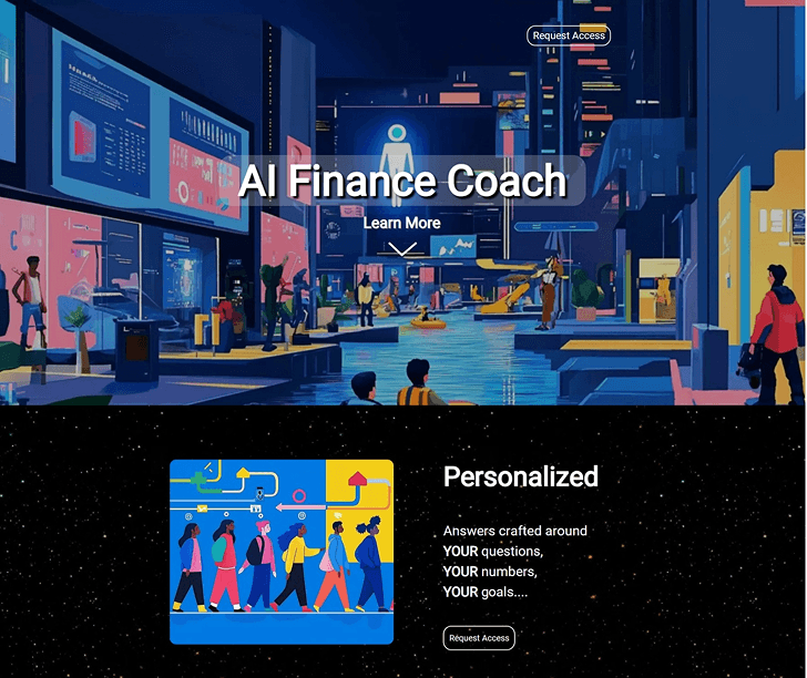
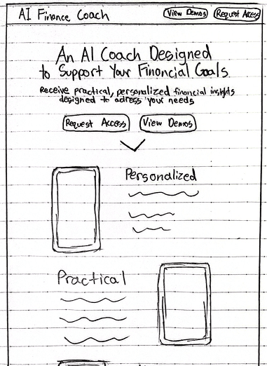
With this context in mind, I created a basic sketch of the home page.
I wanted the home page to easily inform the viewer on what the purpose of the app is, what makes it stand out, and how they could access it.
As I continued to iterate on the home page design, I added a section for demo videos of the app, a testimonial section, and a security section.
Later, I also designed an “About us” page to give viewers a background on the company and team that worked on the app. I also designed a “Security” page to inform readers on how their information is protected.
User Interviews
Throughout the process of redesigning the website, I conducted 10 user interviews. During the interviews, I asked participants to complete the same set of tasks on both original and redesigned website to learn what could be improved and if my redesign was effective.
I asked them to sign up for access to the app, to watch a demo of the app in-action, to learn about the security of the app, and to learn more about the company that created the product.
During these interviews I marked down participants’ actions and opinions while navigating the sites.
I learned that the original website had buttons that were not clearly interactable, unclear navigation, and distracting graphics.
I also learned that my website redesign needed additional changes as well. For example, initially, the redesign lacked testimonials to build trust with viewers. Participants also mentioned that the website lacked information about the company that created the product.
With feedback about the original website and one of my redesigns, I iterated upon my design to improve it.
Reflection
During this project, I gained a deeper understanding about the importance of a home page in shaping first impressions and establishing credibility. Through this, I also realized some of the limitations of design alone. Visuals and layouts can guide users, but they alone cannot always completely convey a message.
Initially, I attempted to communicate the purpose of the app and build credibility only using one page. However, to further build trust I needed additional context to describe both the security of the app and more about the company. Because of this, I created "Security" and "About Us" pages.
I also learned more about receiving feedback and how to take it into account. During the project, I would receive feedback from both my project manager and the company founder. Furthermore, I received data from various user interviews. Because of this, I would receive feedback on many different aspects of the site and sometimes even conflicting feedback.
To make design decisions, I had to carefully weigh each perspective. I had to evaluate the purpose of each element, considering both its potential benefits and drawbacks before implementation.


